Breast Cancer Decals: Why Awareness and Visibility Save Lives
- Foreword: A Symbol You Can See From Across the Parking Lot
- 1. The Evolution of a Symbol: From Ribbons to Decals
- 2. Why Visual Cues Matter in Health Communication
- 3. Sociocultural Resonance: What Decals Communicate Without Words
- 4. Practical Guide: How to Use Decals to Promote Breast Cancer Awareness
- 5. The Commercial Trap: When Symbols Get Diluted
- 6. What’s Next: The Future of Symbol-Driven Awareness
- 7. Strategy Blueprint for Advocates and Organizations
- 8. FAQ – Frequently Asked (and Frequently Unspoken) Questions
- 9. Closing Thoughts: Symbols That Stay With Us
Foreword: A Symbol You Can See From Across the Parking Lot
You don’t forget the first time you see a pink decal in the wild — not the ribbon pinned to a corporate newsletter or the logo on a charity T-shirt, but the quiet kind. Faded. Maybe a little weather-worn. Stuck to the back windshield of an old SUV or the corner of a café’s glass door. You notice it because it’s out of place, slightly defiant. Not promotional. Not decorative. Just… present.
And if you’ve ever been close to breast cancer — as a patient, a family member, a friend — you know what that symbol feels like. It’s a flag, but not the waving kind. It doesn’t scream. It holds space. It says: this touched my life. I’m still here. We’re still here.
That’s where this article begins — not with disease, but with visibility.
In a world saturated with content and causes, we’re used to big gestures. Viral campaigns. Hashtag months. Awareness drives with timelines and sponsorship tiers. And all of those have value — but what about the small, persistent things? What about the quiet visuals that slip past our filters and into our daily lives?
This piece is about one of those things: breast cancer decals. Yes, decals. Not the most obvious hero of public health communication, maybe. But as you’ll see, they’re far more than stickers. They’re a subtle kind of infrastructure — a symbolic thread that runs through public spaces, private grief, hopeful survivorship, and community expression.
Why write an entire, in-depth article about something so small?
Because small things matter — especially when they’re repeated, when they’re seen, when they build a new kind of awareness that isn’t staged but lived. And because in the pink-saturated noise of October campaigns and corporate gestures, it’s easy to forget that symbols, when used with care and clarity, can still move us. They can still do something.
This is your final-stop resource — whether you’re just learning about the power of awareness symbols or looking to deepen the way you use them in your community, business, or advocacy work. We’ll explore the origins of breast cancer symbols, the psychology behind why they work, their role in shifting cultural narratives, and how to deploy them meaningfully without falling into performative traps.
By the end, you’ll understand why that decal on the bumper of the car in front of you isn’t just a pink sticker.
It’s a marker. A message. A mirror.
Let’s look closer.
1. The Evolution of a Symbol: From Ribbons to Decals
Let’s begin with something deceptively simple: a pink ribbon. You’ve seen it — pinned to a blazer, looped on a bumper sticker, printed on a coffee cup sleeve in October. But how did that modest piece of fabric evolve into one of the most recognized emblems in global health?
The story isn’t as corporate as you might think — not at first, anyway. The original pink ribbon wasn’t born from a branding session, but from the hands of Charlotte Haley, a woman whose sister, daughter, and granddaughter had all battled breast cancer. In the early 1990s, Haley began sending out peach-colored ribbons attached to cards urging lawmakers to increase funding for cancer prevention. It was intimate, grassroots, and deeply personal. Only when Estée Lauder and Self Magazine approached her — and she declined, fearing commercialization — did the now-iconic pink version emerge. Legally, the corporations had to tweak the color to differentiate it from her original activism. And so, the soft pink ribbon was born, stripped of its original protest edge but poised for mass recognition.
| Aspect | Pink Ribbon | Breast Cancer Decal |
|---|---|---|
| Primary Use | Event visibility, short-term awareness | Everyday visibility, ongoing presence |
| Typical Placement | Clothing, promotional materials | Vehicles, storefronts, personal items |
| Emotional Tone | Supportive, ceremonial | Lived-in, personal, persistent |
| Perceived Authenticity | Sometimes seen as corporate or campaign-based | Often viewed as grassroots or individual expression |
| Duration of Exposure | Temporary (events, October campaigns) | Long-term, embedded in daily life |
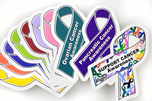
Today, the ribbon is everywhere. But with that ubiquity comes a dilution of meaning. In recent years, something quieter but more pervasive has begun to surface — breast cancer decals.
Decals are the modern symbol’s evolution. They’re not seasonal, like ribbons. They don’t require a cause-marketed product to appear. They’re permanent (or at least semi-permanent), visible in the wild — on car bumpers, storefronts, laptop lids, phone cases, helmets. Unlike the ribbon, which often appears in the safety of curated environments, decals live in the real world. They’re not staged. They simply exist — and in doing so, they speak.
But why decals? Why this shift? And what do they accomplish that a ribbon, social post, or walkathon doesn’t?
To understand that, we have to think about the social life of symbols. A ribbon on a blazer at a gala says something — it says “I support.” A decal on a rear windshield says something else: “I live with this.” It’s not a borrowed accessory for the month of October. It’s a stake in the ground, a reminder in traffic, at the gas pump, in the school pickup line, that breast cancer is part of someone’s daily life. It’s durable awareness.
And unlike transient digital moments — say, an Instagram story with a pink filter — a decal isn’t easily swiped past. It’s passive visibility turned active: you see it once, maybe twice, and then the third time you ask yourself, When was my last mammogram?
For survivors, decals can be quietly empowering. For families, they can be tributes. For the general public, they’re conversation-starters — or sometimes conversation-enders, when that’s what someone needs. And here’s an unexpected layer: for people outside of the “expected” demographic — say, men or younger adults — breast cancer decals challenge the assumption that this is a niche issue. They hint at the real scope of the disease.
But none of this happened by accident. The movement toward using decals reflects a broader shift in how we think about awareness. Not as charity, not as marketing, but as visual literacy. If you want to embed a message into a culture, make it visible, make it persistent, and make it feel personal. Decals do all three — quietly, persistently, and without demanding attention in the way a fundraiser might.
Still, it’s worth pausing on this: have we reached a point where symbolism outpaces substance? Or can the two coexist?
That’s a fair concern, and it brings us to a key point — it’s not about replacing the ribbon, but about building on it. Breast cancer decals are the next step in a continuum: an everyday, democratized symbol that slips out of the charity circuit and into real life. Where the pink ribbon opened doors, decals walk through them.
This topic often intersects with personal identity and survivorship, so it’s worth reading about Refusing Hormone Therapy for Breast Cancer, which explores decisions that shape long-term outcomes.
Next, we’ll explore why visual cues like these are so powerful — not just emotionally, but neurologically — and why the things we see most often may influence our health decisions more than any statistic ever could.
2. Why Visual Cues Matter in Health Communication
Let’s take a step back from the pink and the personal. Strip away the emotional charge, and what do you get? A deceptively simple question: why do visual symbols like breast cancer decals work so well?
It’s tempting to think the answer is “because they’re everywhere,” or “because they’re pink,” or even “because they’re heartfelt.” But the real reason? It’s deeper. Decals — like all enduring symbols — work because our brains are wired to prioritize what we see.
We’re visual creatures. Over 50% of the human brain is devoted to processing visual information. Not sound. Not text. Vision. That’s why you’ll remember a pink ribbon stuck to the back of a dusty SUV long after you’ve forgotten last week’s health infographic. It’s not just branding — it’s biology.
There’s a concept in psychology called the picture superiority effect. It’s the reason an image of a cracked pink heart on a decal might stick in your mind longer than a thousand-word article about cancer statistics. When we process both images and words together, retention jumps dramatically. This is especially true when the visual cue is simple, emotionally charged, and repeated in low-stakes contexts — like, say, a decal you pass every morning on the way to work.
So when we talk about awareness, we’re not just talking about sentiment. We’re talking about visual saturation — not in an aggressive, billboard-overload kind of way, but in the gentle, cumulative drip of quiet reminders. A decal isn’t a shout; it’s a whisper repeated daily. And here’s the kicker: those whispers work. They create what psychologists call mere exposure familiarity — the more we see something, the more we accept it, normalize it, even internalize it.
| Psychological Concept | Description | Relevance to Decals |
|---|---|---|
| Picture Superiority Effect | Visuals are more likely to be remembered than words alone | Decals outlast posters or announcements in memory |
| Mere Exposure Effect | Familiarity increases preference and trust | Repeated visual contact with decals normalizes breast cancer talk |
| Implicit Priming | Visual stimuli can subtly influence attitudes and behavior | Seeing a decal may prompt action (like scheduling a screening) |
| Emotional Salience | Emotionally charged visuals trigger stronger cognitive engagement | Personal decals evoke survivorhood, loss, and resilience |
And that’s critical in breast cancer communication. Why? Because fear is a cognitive roadblock. The idea of cancer often short-circuits our rational brain. It triggers avoidance, denial, procrastination. But visual cues like decals don’t confront you with charts or grim diagnoses. They say, without saying: This is real. This exists. We talk about it here.
There’s also something to be said for indirect communication. Not everyone responds well to being told outright: “You need a mammogram.” But everyone has paused behind a car in traffic. Everyone’s stood in line at a café and glanced at a laptop covered in stickers. The power of the decal is in its subtlety. It doesn’t demand attention. It earns it. That’s a critical distinction in modern health messaging — where people are bombarded with prompts, popups, and alerts, something calm and physical can actually cut through the noise more effectively.
And let’s not underestimate the role of relatability. A pink ribbon might say “awareness.” But a well-placed decal on a battered, well-traveled SUV? That says “experience.” It’s a signal — one human to another — that someone, somewhere, has lived through this. Or is living through it. That touch of authenticity is everything in an era where audiences are fatigued by performative support and empty slogans.
Of course, there’s a counter-question worth asking: are we oversaturating the space? Do we risk desensitization?
It’s a valid concern. When something is everywhere, it can fade into background noise. But here’s where decals still hold their edge — they’re low-volume but high-visibility. They’re not plastered on ad walls or forced into your feed by an algorithm. They appear when someone chooses to place them. They mean something personal. And because of that, they retain their gravity.
That leads to an important distinction: seeing a decal isn’t just seeing a cause. It’s seeing a person. Someone with a history. Someone who lost someone. Someone who made it. That’s the quiet brilliance of these symbols. They don’t speak in generalities. They humanize an illness that, too often, is reduced to numbers and campaigns.
Next, we’ll explore how these visuals intersect with culture — how a simple decal can do more than spread awareness: it can shift the tone of entire conversations around breast cancer.
3. Sociocultural Resonance: What Decals Communicate Without Words
Let’s sit with a small but powerful idea: sometimes, saying nothing at all says everything. That’s the quiet power of breast cancer decals. They don’t shout, they don’t explain — and yet they speak volumes. Not just about disease, but about how we live with it, talk about it, or don’t. And crucially, about how we, as a culture, treat those who’ve walked through it.
Think about what it means to see a breast cancer decal on a taxi in Istanbul, a grocery bag in Johannesburg, or a motorcycle helmet in Detroit. Each instance is shaped by its local context — but the underlying message is uncannily consistent: this is real, this is close, and it affects us. The symbol travels, but it doesn’t flatten. It adapts.
That adaptability matters. In some cultures, breast cancer is still whispered about behind closed doors. In others, it’s visible but sterilized — a disease talked about clinically, rarely personally. In still others, it’s openly discussed, but framed through narratives of battle and survival, often leaving out stories that don’t fit that mold. A decal — by being nonverbal, decentralized, and quietly persistent — sidesteps a lot of these linguistic and narrative bottlenecks. It doesn’t ask anyone to use the right words. It just is, and in that being, it gives others permission to acknowledge their own experience.
This is where things get interesting. The role of decals is not simply to raise awareness — that’s the surface function. More subtly, they create social permission structures. What does that mean? It means when you see a decal in your community — especially if you live in a place where breast cancer is still stigmatized or hidden — it signals: someone here has spoken. Someone has made this visible. And that changes the landscape, however slightly.
Because visibility isn’t just a data point. It’s a cultural temperature check. It tells us what’s okay to talk about, and how. And once you start noticing these symbols around you, you realize how they quietly shape norms. A café with breast cancer decals in the window isn’t just supporting a cause — it’s creating a space where conversations might feel a little more possible. A school bulletin board with student-designed awareness decals isn’t just doing outreach — it’s signaling that health and vulnerability belong in public discourse.
And there’s another layer — one that often goes unnoticed. For many people, especially those who aren’t the expected face of breast cancer, decals offer something rare: representation.
Yes, breast cancer mostly affects women. But not only women. Men get breast cancer, too. So do trans and nonbinary people. Young adults. People in communities where screening is rare or inaccessible. When those individuals place a decal — on their gym bag, their bike, their clinic — it’s not just support. It’s identity. And in a world that often excludes or erases those stories, even the smallest visual marker becomes quietly radical.
This is not just about pink ribbons anymore. This is about reclaiming public space for real narratives, without requiring a TED talk or an awareness month or a dramatic reveal. Just a simple, unassuming visual statement: this touched me, and I’m not hiding it.
Of course, there are risks with symbolism. Oversaturation, misinterpretation, commodification — we’ll get into those later. But the cultural function of the breast cancer decal remains potent: it takes the private and makes it public in a way that is neither aggressive nor abstract. It lets us carry the story, without needing to tell the whole story.
And that, maybe, is the true genius of these small symbols. They hold space. Not just for awareness — but for memory, solidarity, grief, celebration, discomfort, survival, uncertainty. For the messy human reality of a disease that too often gets reduced to sanitized slogans or clinical bullet points.
In the next section, we’ll shift from theory to practice. If you’re wondering how individuals and organizations can use these symbols in ways that are genuinely impactful — and not just decorative — that’s exactly where we’re headed.
4. Practical Guide: How to Use Decals to Promote Breast Cancer Awareness
So you get it now — decals aren’t just pink stickers or feel-good tokens. They’re tools. Cultural prompts. Micro-billboards that travel silently through everyday life, influencing behavior, sparking thoughts, building a sense of shared experience. But here’s the natural next question: How do you actually use them well?
It’s surprisingly easy to slap a decal onto something and call it a day. But meaningful usage — the kind that builds awareness without feeling hollow — requires thought. It’s about context, intention, and reach. So whether you’re an individual wanting to make a quiet statement, or an organization looking to amplify impact, there are smarter, more nuanced ways to make decals work for you — and for the cause.
Let’s start simple.
As an individual, where and how you place a decal says something. A decal on your laptop? That lives in meetings, coffee shops, classrooms — public but conversational. A decal on your car? That’s visibility in traffic, parking lots, and drive-thrus — passive exposure at scale. A decal on your phone case? That’s intimate — friends, family, strangers at checkout counters will see it. And it’s worth asking: what are you trying to say?
If you’re a survivor, maybe your decal says “still here.” If you lost someone, maybe it’s a tribute. If you just care — if you want to be part of a world where people talk about early screening and risk reduction the same way they talk about weather — maybe your decal is a conversation starter. The point is, even the smallest symbol carries the weight of the person behind it. People feel that.
Now think bigger.
Organizations have the power to turn decals from symbol into strategy. Want to run a local awareness campaign? Don’t start with a billboard. Start with a decal — or better yet, a thousand decals. Distribute them in clinics, cafes, salons, gyms. Let them travel. Let people decide where to place them. Visibility isn’t just about being seen — it’s about showing up where people live their lives.
| Location | Visibility Level | Audience Reach | Emotional Tone/Impact |
|---|---|---|---|
| Storefront Windows | High | Broad, general public | Public support, normalization |
| Personal Laptops | Medium | Peers, clients, students | Approachable, conversation-starting |
| Gym Lockers or Mirrors | High | Health-conscious individuals | Reflective, ties health to awareness |
| School Notebooks or Binders | Low–Medium | Youth and educators | Subtle introduction to awareness |
| Car Bumpers | High | Commuters, community observers | Durable presence, passive social signaling |
The best campaigns know this. They don’t flood you with information — they create presence. They understand that a decal on a shop window is different from one in a library. A sticker on a water bottle might reach a totally different demographic than one mailed inside an insurance bill. There’s strategy in placement. And organizations that get that — that know their community well enough to read the landscape — create messages that stick. Literally and figuratively.
There’s also room for collaboration. Local artists can design decals that reflect the identity of the neighborhood. Schools can involve students in awareness challenges. Fitness centers can co-brand decals with early detection slogans. It’s not about slapping pink onto every surface. It’s about embedding meaning into a visual form — so the message is seen, remembered, felt.
And then there’s the digital layer, which too many still ignore. In a world where so much happens online, physical decals don’t have to be the end of the conversation — they can be the start. QR codes integrated into decal designs can lead to resources: screening checklists, survivor stories, donation links, myth-busting facts. Or go bolder: augmented reality decals that animate when scanned. Snapchat filters. Instagram sticker packs for Breast Cancer Awareness Month — or better, for beyond awareness month. Let the visual identity of the movement live where people already are: on screens, in feeds, in the scroll.
Is it gimmicky? Not if it’s done right. Not if the heart stays intact.
One of the smartest things you can do — whether you’re one person or a campaign team — is ask: what experience are we creating with this decal? Not just what it says, but where it appears, who sees it, what mood it evokes, and how it fits into daily life. That’s what separates a background sticker from a powerful cue.
And one more point that deserves attention: accessibility. Not everyone sees pink as empowering. Not every community responds to the same color palette or language. That’s okay — in fact, that’s an opportunity. Don’t be afraid to customize. Multilingual decals, different shades of pink, culturally adapted icons — these aren’t distractions from the message, they’re amplifiers. They widen the circle.
At its best, a breast cancer decal isn’t just a symbol of awareness. It’s a seed. A visual cue that invites reflection, prompts memory, inspires action. Used thoughtfully, it can do more than decorate a surface. It can change a conversation — or start one that’s long overdue.
Also relevant: how public awareness translates into medical engagement, like in 12 Early Signs of Breast Cancer You Shouldn’t Ignore.
Coming up, we’ll tackle the tricky terrain of criticism — how good intentions can go sideways, and how to avoid turning meaningful awareness into shallow optics. Because this work, if it’s going to last, has to be more than just visible. It has to be honest.
5. The Commercial Trap: When Symbols Get Diluted
It happens quietly. At first, the pink feels powerful — a rallying cry, a beacon of solidarity. Then one day, it’s on a cereal box. Then a shampoo bottle. Then a garbage truck. And eventually, a shift occurs: people stop seeing the symbol as meaningful and start seeing it as marketing. Welcome to the uncomfortable conversation about pinkwashing — and why even the most well-intentioned symbols like breast cancer decals can lose their soul if we’re not careful.
This isn’t about villainizing companies. It’s about recognizing the thin line between awareness and appropriation. When breast cancer decals — or pink ribbons, for that matter — are used as blanket branding tools, stripped of context or connection to real impact, something subtle but important breaks. People begin to associate the symbol not with care or urgency, but with sales, superficiality, and seasonal lip service.
You’ve probably felt it, even if you haven’t named it. The vague discomfort when you see a fast-food wrapper with a pink ribbon but no mention of actual support. Or when a product boasts “a portion of proceeds goes to breast cancer research,” yet you can’t find a breakdown of where that money really goes. It’s not cynicism. It’s discernment.
And it matters — because trust is fragile. Once people sense that the symbol is being exploited, not honored, they disengage. And if the symbol loses credibility, so does the cause behind it.
So how does this connect to decals?
Decals walk the same tightrope. Used authentically, they’re grassroots gold. But used carelessly — mass-produced without meaning, handed out as throwaway merchandise, or slapped on a campaign with no survivor voices, no education, no plan — they become noise. Worse, they become performative: more about being seen to care than actually caring.
Let’s be clear — visibility alone isn’t the enemy. A well-placed decal on a store window, a bus, a basketball court — that can absolutely spark awareness. But the moment the decal becomes decorative, detached from purpose, it stops working as a tool and starts functioning as a mask. And masks, by definition, obscure reality.
This is particularly risky in corporate settings, where breast cancer “awareness” gets funneled into October-only initiatives. You’ve seen them — “Paint it Pink!” promotions, pink-washed logos, uniform changes, all the optics. But when October ends? Silence. No follow-through, no year-round education, no support for patients or staff. This isn’t awareness — it’s seasonal branding with a pink coat of paint.
And it’s not just bad ethics — it’s a missed opportunity. Because the truth is, authentic engagement is a far better business strategy. Consumers today are sharp. They read fine print. They care where their dollars go. Brands that back up their visuals with real actions — transparent donations, survivor-led design, policy changes for employee health benefits — they’re the ones that gain lasting respect.
The same applies to nonprofits and community organizers. If you’re going to distribute decals, build the infrastructure around them. Include context. Host conversations. Share data. Spotlight real people. Because a decal, on its own, is a fragment. Its power lies in how it connects to a larger narrative.
And if you’re wondering what this means for small-scale efforts — you, your school, your local gym — don’t overthink it. The fix isn’t to abandon the symbol. It’s to earn it. A decal with heart, placed with care, is worth far more than a box of generic pink stickers. Especially if it’s paired with a handout, a conversation, a link to screening services. This is not about perfection. It’s about alignment — making sure the visual matches the values.
Here’s the bottom line: breast cancer awareness shouldn’t be aestheticized into oblivion. The symbols we use matter because they represent real people, real losses, real wins, and real complexity. When we treat decals — or ribbons, or merch, or messaging — as if they’re ornamental rather than consequential, we risk flattening a human issue into a branding exercise.
So how do we protect the integrity of these symbols while continuing to use them? By staying rooted in intention. By elevating the stories they represent. And by refusing to reduce the fight against breast cancer to a seasonal palette and a marketing plan.
Next, we’ll look ahead. Because if the current visual language around breast cancer is starting to fray, that just means we’re due for evolution — and there are some truly exciting ways forward. From smart materials to community co-creation, the next wave of awareness symbols may look nothing like what we’ve seen before — and that might be exactly what the movement needs.
6. What’s Next: The Future of Symbol-Driven Awareness
Every symbol, no matter how iconic, has a lifecycle. It gains meaning, reaches a cultural peak, and — if not renewed — risks becoming inert. The pink ribbon had its ascent. Breast cancer decals are riding their own wave now, steadily embedding themselves into the visual fabric of everyday life. But if we want these symbols to continue working — not just existing, but actually functioning — we have to ask a question that many campaigns sidestep: what comes next?
Staying relevant means evolving. Not abandoning what’s working, but refining it — expanding its vocabulary, modernizing its channels, and deepening its emotional resonance. Because let’s be honest: we’re living in a time of hypervisuality. Our attention is fragmented. Static images are everywhere. And if a symbol is going to stand out, it can’t afford to be static — not metaphorically, and maybe not even literally.
This is where technology steps in.
Imagine a breast cancer decal that isn’t just a flat pink graphic, but one embedded with a QR code. You scan it, and it takes you to a local screening site, a survivor’s story, or a virtual support group. Now the decal isn’t just a signal — it’s a portal. It bridges awareness with action. And it does it seamlessly, right where the user already is: on their phone, in their car, in their day.
Push the idea further. What if decals used augmented reality? You hover your camera over a symbol, and it comes alive — unfolding into a story, a statistic, a call to donate, a moment of remembrance. Suddenly, awareness isn’t passive. It’s interactive. And for younger generations raised in the swipe-scroll-tap ecosystem, that kind of engagement isn’t just appreciated — it’s expected.
But innovation doesn’t have to mean bells and whistles. Sometimes, evolution looks like personalization.
We’ve seen a shift toward user-generated content in almost every space — from politics to skincare. Why should breast cancer awareness be any different? What if survivors, caregivers, and supporters could co-create their own decals? Choose colors that resonate with their journey, add dates or initials, adapt language and design to cultural context? A “one-size-fits-all” symbol might work on a corporate level, but identity is personal. And the more you invite people into the design process, the more ownership they feel over the message — and the more meaningful the symbol becomes.
Think, too, about collaboration. Not just between survivors and nonprofits, but between artists, technologists, designers, and communities. Bring in illustrators who know how to convey nuance. Partner with textile innovators experimenting with smart materials — imagine decals that change color based on temperature, touch, or exposure to light. Now we’re not just communicating awareness. We’re making the symbol respond, adapt, live.
And there’s an ethical dimension to all this. With every innovation, there’s a responsibility to keep authenticity intact. Technology should enhance connection, not replace it. Personalization should empower, not isolate. Creativity should elevate stories — not flatten them into gimmicks.
It’s also worth asking: what symbols haven’t we tried yet?
The pink ribbon is dominant, yes — but maybe there’s room to expand the visual language of breast cancer. Could a series of modular symbols tell different aspects of the experience — diagnosis, treatment, remission, grief, advocacy? Could we move beyond pink entirely for some communities, especially where color has different cultural meanings? The future of awareness may not lie in finding a single new icon, but in building a more flexible system of symbols — layered, contextual, diverse.
For the research-leaning reader, the Miami Breast Cancer Conference 2025 shows how the conversation continues evolving in science and advocacy circles alike.
Because at the end of the day, the goal isn’t to dazzle. It’s to connect. To reach people where they are, with tools that resonate, in ways that feel fresh but grounded.
If the first wave of breast cancer awareness was about visibility, and the second about engagement, the third wave — the one we’re stepping into now — is about integration. Making symbols not just seen or liked, but lived with. Making them part of the social architecture, the design of everyday life.
So whether it’s a decal that glows softly at night, or one that whispers a story through your phone, or one you made with your own hands to honor someone you miss — the next generation of breast cancer awareness won’t just catch the eye. It’ll change what happens next.
And that’s the point, isn’t it? Awareness isn’t the endgame. It’s the spark. The real work — the checkup scheduled, the stigma broken, the conversation started — comes after. Symbols just open the door. What we do next… that’s what defines the movement.
8. FAQ – Frequently Asked (and Frequently Unspoken) Questions
Let’s talk about the quiet questions. The ones that linger after the campaign ends, after the decals fade into the background of everyday life. These aren’t always the questions people ask out loud — sometimes they’re tucked away in the back of the mind, nagging or uncertain. But they matter. Because breast cancer awareness can’t just live in the public square — it has to resonate in the personal corners, too.
So let’s illuminate them.
1. Why are decals considered powerful tools in awareness work?
They’re not just about being seen — they’re about being felt. A decal is a visual prompt that operates outside the traditional noise of health messaging. It’s unintrusive, but persistent. It’s personal, but public. And that balance gives it staying power. Decals enter people’s days without asking for permission — they sit in traffic, on windows, in checkout lines. Over time, they become part of the visual landscape. And once a symbol embeds itself there, it starts to shift perception. That’s how awareness gets internalized.
2. Where should decals be placed for maximum impact?
Not everywhere — somewhere thoughtful. High-traffic areas help, yes, but so do emotionally resonant ones. Think waiting rooms, mirrors, school notebooks, personal tech. Think places where people pause. The power isn’t in quantity alone. It’s in context. One well-placed decal on a locker room mirror — seen every day before and after workouts — might have more influence than ten on a bulletin board no one checks.
3. Isn’t there a risk that we’re just slapping pink on everything and calling it awareness?
Yes. That’s the pinkwashing problem — and it’s real. When symbols are used without substance, when companies adopt pink for the optics without supporting survivors or funding care, people notice. And when trust erodes, even sincere campaigns suffer. That’s why intentionality matters. A decal has to mean something. It can’t just be decorative.
4. Do decals even make a difference in stigmatized or conservative communities?
They can — and often do — if designed and placed with cultural sensitivity. Decals are nonverbal, which can be a gift in environments where open dialogue is harder. They can signal solidarity without confrontation. They can start a conversation — or allow someone to recognize their experience in someone else’s symbol. Used wisely, they’re a form of quiet resistance. Of visibility without spectacle.
5. What about digital decals — are they effective, or are we just chasing trends?
Digital decals — social stickers, augmented reality overlays, even NFT-style awareness badges — absolutely have potential. The key is to use them strategically, not superficially. They should link to real resources. They should be easy to share but meaningful to use. The future of awareness includes these tools — but only if they’re part of a larger storytelling or support ecosystem. Otherwise, they become just another empty gesture in a crowded feed.
6. Can anyone make a decal, or does it need to be “official”?
Anyone can make one. And sometimes, the grassroots ones are the most powerful. A hand-drawn sticker, a custom design from a survivor — these feel real. That said, if you’re distributing decals as part of a larger campaign, it’s worth considering branding cohesion, messaging clarity, and accessibility (including multilingual versions or inclusive imagery). But no, it doesn’t have to be official to be effective. It has to be genuine.
7. How do you know if a decal is “working”?
Harder than it sounds — because impact isn’t always visible. But you can track QR scans, observe increased clinic engagement, collect stories and testimonials. You can watch for the subtle signs: more conversations, more visibility, more people asking “Where can I get one of those?” Awareness doesn’t always roar. Sometimes it builds in whispers.
8. Are there colors or icons other than pink that can be used?
Absolutely. Pink is powerful, but it isn’t sacred. Many people have complicated feelings about it. Some communities connect more with teal and pink (for inflammatory breast cancer), or gray (for male breast cancer), or even gold (to represent hope and survivorship). Design is emotional — and should be culturally aware. Symbols should adapt, not dictate.
9. Can decals honor someone without feeling exploitative?
Yes — but tread carefully. Commemorative decals can be beautiful and deeply moving when done with consent, intention, and love. Avoid anything that feels like spectacle or tokenization. Include the family or individual in the design process if possible. Let it feel personal, not commercial.
10. Where can I find decals that are ethically produced and actually support the cause?
Look for transparency. Does the seller specify how much goes to charity — and to which charity? Are survivors involved in the design or production? Are they clear about where the money and message go? If not, move on. There are many incredible nonprofits, survivor-led shops, and community initiatives doing this right. Vote with your wallet — and your visibility.
Next, we’ll close with a look at what it all adds up to — and why, after everything we’ve explored, breast cancer decals still matter. Not just because they exist. But because of what we choose to do with them.
9. Closing Thoughts: Symbols That Stay With Us
There’s a moment — maybe you’ve felt it — when a symbol stops being something you notice and starts being something you carry. It doesn’t flash or demand. It lingers. A quiet presence in your day. That’s what a well-placed, well-used breast cancer decal can become: not a piece of flair, but a marker of memory, meaning, momentum.
And it’s easy, especially in an attention economy, to underestimate that kind of subtlety. We’ve been conditioned to look for the loudest, the fastest, the trendiest signals of support. But what if the most enduring impact comes not from those who shout the loudest, but from those who build something others live with — daily, gently, unavoidably?
That’s what decals do, at their best. They live where people live. They don’t wait for an annual gala or a viral moment. They’re in the background — but never forgotten. And in a world where breast cancer remains both common and underdiscussed, that quiet presence matters. Because people don’t always need another statistic. Sometimes they need a sign.
A sign that someone else has been there. That someone else sees them. That someone else is willing to take up space, however small, to say: this is real. This is part of life. This deserves to be seen.
That kind of visibility changes things. It changes the way someone might feel about scheduling that overdue mammogram. It changes the willingness of a teenager to ask what breast cancer is. It changes the texture of public space — from impersonal to personal, from passive to participatory.
And yes, we’ve covered the potential pitfalls: commodification, oversaturation, performative gestures. These are real concerns, and they deserve continued scrutiny. But avoiding symbols altogether isn’t the answer. Redefining them is.Rooting them in story, context, creativity, cultural nuance. Using them not to check a box, but to open a door.
Because awareness — real awareness — isn’t the finish line. It’s the front porch. It’s what happens before the phone call to the clinic. Before the conversation with a daughter, a friend, a doctor. It’s the nudge. The seed. The thing that lingers until it becomes too real to ignore.
That’s what decals offer. Not a solution. Not a cure. But a shift. A symbol that keeps the topic from fading into the background noise of busy lives and competing causes. A reminder that the fight — for visibility, for equity, for early detection, for support — is still happening. Every day.
So if you’re thinking about using one, designing one, distributing one — do it. But do it with thought. With love. With story. Ask not just how it looks, but what it holds.
Because what you’re really offering isn’t a sticker. It’s a signal.
To keep talking.
To keep showing up.
To keep making space for something that still touches — and takes — far too many lives.
Symbols fade. But intention doesn’t. The best decals are the ones that carry both. And if we treat them not as the end of the conversation, but as its quiet beginning, they’ll keep doing what they were meant to do all along: help us see what was already there. And remind us to act.,